
Color is one of the first things people notice in mosaic art. In Slavic mosaics, color was never chosen at random. Each shade played a role in shaping mood, meaning, and memory. Long before viewers studied technique or history, they understood mosaics through color.
Traditional Slavic mosaic artists worked with limited palettes. This was partly due to material availability, but it also encouraged careful decision-making. With fewer colors to choose from, every tone needed a purpose. Color became a tool for communication.
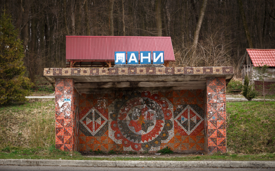
Blue appears often in Slavic mosaics. It is commonly used in backgrounds or wide open areas. Blue creates a sense of calm and depth. It helps other colors stand out without overwhelming the viewer. In many traditions, blue is associated with reflection, continuity, and distance. These meanings made it ideal for public spaces meant to feel balanced and open.
Green is closely tied to nature. It connects human figures to landscape and environment. Green tones often appear in surrounding elements rather than central figures. This placement reinforces ideas of growth, renewal, and harmony. In regions where daily life depended on land and seasons, green carried strong emotional weight.
Red is used more sparingly, but with strong intention. It draws the eye immediately. Red often marks important moments, figures, or symbols. It communicates warmth, energy, and protection. Because it is visually powerful, artists used it carefully to avoid distraction.
Yellow and gold tones bring light into a composition. Even when real gold was not used, warm yellows created a sense of brightness and importance. These colors often highlight key areas or add warmth to otherwise cool palettes. They help mosaics feel welcoming rather than distant.
Color relationships matter just as much as individual hues. Slavic mosaic artists paid close attention to balance. Cool colors soften strong shapes. Warm colors create focus. Repetition of certain tones helps unify the surface. Contrast adds movement and interest.
Regional differences also influenced color choice. Northern regions often favored cooler tones, reflecting climate, light conditions, and available materials. Southern areas tended to use warmer palettes. These choices were practical, but they also became part of regional visual identity.
Public placement shaped color decisions as well. Mosaics installed outdoors needed colors that remained visible under changing light. Indoor mosaics used softer transitions. Artists understood how color would age, fade, or interact with surrounding architecture.
Mosaic technique adds another layer of meaning. Because mosaics are built from many small pieces, color appears textured rather than flat. Slight variations in tone create movement, even in still compositions. This gives mosaics a sense of life and rhythm.
Preserving original color is one of the greatest challenges in restoration. Replacing faded tones without understanding their role can change the message of a work. Conservation requires respect for the original palette and its cultural context.
Learning to read color helps viewers connect more deeply with Slavic mosaics. It turns looking into understanding. Instead of seeing decoration, viewers begin to notice intention.
For Slavic Art Alliance, color education is an important part of preservation. By explaining how palettes were used, the organization helps audiences appreciate mosaics as thoughtful cultural expressions, not just visual surfaces. Color becomes a bridge between past makers and present viewers.